- by Wouter Nordsiek
- 0 Comments
- Guide
- 31 March 2026
Color Contrast: Making Text Readable for Everyone
WCAG Criteria: 1.4.3 Contrast (Minimum) AA • 1.4.1 Use of Color A • 1.4.11 Non-text Contrast AA
Our accessibility audit of 78 NGI-funded projects found 1,431 color contrast violations across 75 projects, making it the second most common accessibility failure. Nearly every single project had at least one instance of text that doesn't meet minimum contrast requirements.
The good news: contrast issues are among the simplest to fix. You don't need to restructure your markup or rewrite JavaScript. In most cases, you're changing a single hex value in your CSS. This guide gives you the knowledge and the specific color values to do that correctly.
1Understanding Contrast Ratios
A contrast ratio measures the difference in perceived brightness between two colors. The scale runs from 1:1 (no contrast: white on white) to 21:1 (maximum contrast: black on white). WCAG Level AA defines three thresholds:
| Element Type | Minimum Ratio | WCAG Criterion |
|---|---|---|
| Normal text (under 18pt, or under 14pt bold) | 4.5:1 | 1.4.3 |
| Large text (18pt+ regular, or 14pt+ bold) | 3:1 | 1.4.3 |
| UI components & graphical objects (icons, borders, focus rings) | 3:1 | 1.4.11 |
How the Ratio Is Calculated
The ratio is based on relative luminance, not just how "dark" a color looks to you. Each RGB channel is linearized (removing gamma correction) and weighted according to human vision sensitivity:
// Linearize each sRGB channel (0-255 → 0-1)
sRGB = channel / 255
linear = sRGB <= 0.04045
    ? sRGB / 12.92
    : ((sRGB + 0.055) / 1.055) ^ 2.4

// Relative luminance
L = 0.2126 * R_linear + 0.7152 * G_linear + 0.0722 * B_linear

// Contrast ratio (L1 is the lighter color)
ratio = (L1 + 0.05) / (L2 + 0.05)
Green contributes the most to perceived brightness (71.5%), which is why light green text on white fails contrast even when the hex values look "different enough." You don't need to memorize this formula. Tools calculate it for you. But understanding why some color combinations feel readable yet still fail helps avoid frustration when a tool rejects your design.
2Common Problems Found in Our Audit
These are the patterns we saw repeatedly across NGI projects. Each one includes a visual sample so you can see the problem and the fix side by side.
2.1 Light Gray Text on White Backgrounds
The single most common violation. Designers reach for gray to create visual hierarchy, but go too light.
2.2 Link Colors with Insufficient Contrast
Links need to meet two contrast requirements simultaneously: 4.5:1 against the background and 3:1 against surrounding text (or use an underline, which is the simpler solution).
2.3 Focus Indicators with Insufficient Contrast
Focus outlines must have at least 3:1 contrast against the surrounding background. Many sites use thin, faint outlines that vanish on light backgrounds.
/* Barely visible focus ring */
:focus {
    outline: 2px solid #a0cfff; /* 1.63:1 vs white */
}/* Clearly visible focus ring */
:focus {
outline: 2px solid #0056b3; /* 7.04:1 vs white */
outline-offset: 2px;
}
/* Even better: double ring for any background */
:focus-visible {
outline: 2px solid #0056b3;
outline-offset: 2px;
box-shadow: 0 0 0 4px rgba(0, 86, 179, 0.25);
}2.4 Placeholder Text Too Faint
Placeholder text isn't required to meet contrast minimums per WCAG (since it's not "real" content). But if users rely on it for instructions, making it unreadable defeats the purpose. Aim for at least 4.5:1.
/* Many browsers default to ~#a9a9a9 (2.32:1) */
::placeholder {
    color: #c0c0c0; /* 1.6:1 on white */
}::placeholder {
color: #767676; /* 4.54:1 on white */
opacity: 1; /* Firefox reduces opacity by default */
}2.5 Dark Theme Issues
Dark themes introduce the inverse problem: text that's too dim against dark backgrounds, or accent colors that looked fine on white but wash out on dark surfaces.
2.6 Gradients and Image Backgrounds
Text over gradients or images is risky because the contrast changes across the element. Text might pass at the top-left but fail at the bottom-right.
3Implementation Guide
3a. Accessible Text Color Scale
Here's a tested gray scale for white backgrounds. Every value meets 4.5:1 for normal text.
| Use Case | Color | Hex | Ratio on #fff |
|---|---|---|---|
| Headings / Primary text | #1a1a1a |
17.4:1 | |
| Body text | #333333 |
12.63:1 | |
| Secondary text | #595959 |
7.0:1 | |
| Minimum for body text | #767676 |
4.54:1 | |
| Large text only (18pt+) | #949494 |
3.03:1 | |
| Decorative / non-text only | #aaaaaa |
2.32:1 |
3b. Link Styling with Sufficient Contrast
/* Links on white backgrounds */
a {
    color: #0056b3;              /* 7.04:1 on white */
    text-decoration: underline;  /* Always underline so color isn't the only cue */
}

a:hover {
    color: #003d7a;              /* 10.78:1 on white */
}

a:visited {
    color: #5b2d8e;              /* 9.5:1 on white */
}

a:focus-visible {
    outline: 2px solid #0056b3;
    outline-offset: 2px;
}

/* If your design requires removing underlines,
   you MUST have 3:1 contrast between link and body text
   AND provide a non-color hover/focus indicator */
a.no-underline {
    text-decoration: none;
    border-bottom: 2px solid transparent;
}
a.no-underline:hover,
a.no-underline:focus {
    border-bottom-color: currentColor;
}
3c. Focus Indicator Styling
/* Base focus style for all interactive elements */
:focus-visible {
    outline: 2px solid #0056b3;
    outline-offset: 2px;
}

/* High-contrast focus for dark backgrounds */
.dark-section :focus-visible {
    outline: 2px solid #ffd166;  /* Yellow stands out on dark BGs */
    outline-offset: 2px;
}

/* Never do this: */
/* :focus { outline: none; }     ← removes keyboard navigation */

/* If you must customize, always replace with something visible: */
button:focus-visible {
    outline: none;
    box-shadow: 0 0 0 3px #0056b3;
    border-radius: 4px;
}
3d. Button States
/* Primary button - all states maintain contrast */
.btn-primary {
    background-color: #0056b3;
    color: #ffffff;              /* 7.04:1 */
    border: 2px solid #0056b3;
    padding: 10px 20px;
    font-size: 16px;
    cursor: pointer;
    border-radius: 4px;
}

.btn-primary:hover {
    background-color: #003d7a;
    border-color: #003d7a;
    color: #ffffff;              /* 10.78:1 */
}

.btn-primary:active {
    background-color: #002a57;
    border-color: #002a57;
    color: #ffffff;              /* 14.3:1 */
}

/* Disabled buttons: lower contrast is acceptable (not interactive)
   but add visual cues beyond just color */
.btn-primary:disabled {
    background-color: #a0a0a0;
    border-color: #a0a0a0;
    color: #ffffff;
    cursor: not-allowed;
    opacity: 0.7;                /* Additional visual cue */
}

/* Secondary / outline button */
.btn-outline {
    background-color: transparent;
    color: #0056b3;              /* 7.04:1 on white */
    border: 2px solid #0056b3;   /* 3:1+ border contrast */
    padding: 10px 20px;
    cursor: pointer;
}

.btn-outline:hover {
    background-color: #0056b3;
    color: #ffffff;
}
3e. Dark Theme Color Palette
:root {
    /* Light theme */
    --bg-primary: #ffffff;
    --bg-secondary: #f5f5f5;
    --text-primary: #1a1a1a;     /* 17.4:1 on white */
    --text-secondary: #595959;   /* 7.0:1 on white */
    --link-color: #0056b3;       /* 7.04:1 on white */
    --border-color: #767676;     /* 4.54:1 on white */
}

@media (prefers-color-scheme: dark) {
    :root {
        --bg-primary: #121212;
        --bg-secondary: #1e1e1e;
        --text-primary: #e0e0e0;     /* 14.19:1 on #121212 */
        --text-secondary: #b0b0b0;   /* 8.64:1 on #121212 */
        --link-color: #6fb3ff;       /* 8.54:1 on #121212 */
        --border-color: #888888;     /* 5.28:1 on #121212 */
    }
}

body {
    background-color: var(--bg-primary);
    color: var(--text-primary);
}

a {
    color: var(--link-color);
}
3f. Handling Gradients and Image Backgrounds
/* Technique 1: Semi-transparent overlay */
.hero-section {
    position: relative;
    background-image: url('hero.jpg');
    background-size: cover;
}

.hero-section::before {
    content: '';
    position: absolute;
    inset: 0;
    background-color: rgba(0, 0, 0, 0.6);  /* Dark overlay */
}

.hero-section .content {
    position: relative;  /* Sit above the overlay */
    color: #ffffff;
}

/* Technique 2: Text container with solid/semi-solid background */
.hero-section .text-box {
    background-color: rgba(0, 0, 0, 0.75);
    padding: 24px;
    border-radius: 8px;
    color: #ffffff;
}

/* Technique 3: Text shadow as fallback (not sufficient alone) */
.image-caption {
    color: #ffffff;
    text-shadow:
        0 1px 3px rgba(0, 0, 0, 0.8),
        0 0 8px rgba(0, 0, 0, 0.6);
    /* Better than nothing, but use overlays for critical text */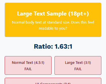
}4Interactive Contrast Checker
Preset problem combos from our audit:
Ratio: 4.54:1
5Common Accessible Color Palettes
Copy-paste ready palettes tested against white (#ffffff) backgrounds.
Blues
| Swatch | Hex | Ratio on #fff | Use for |
|---|---|---|---|
#003d7a | 10.78:1 | Headings, primary actions | |
#0056b3 | 7.04:1 | Links, buttons | |
#0073e6 | 4.63:1 | Borders (just passes normal text) |
Greens
| Swatch | Hex | Ratio on #fff | Use for |
|---|---|---|---|
#1a7a2e | 5.46:1 | Success text, passing indicators | |
#0d6520 | 7.24:1 | Body text in success contexts | |
#28a745 | 3.0:1 | Large text or icons only |
Reds / Errors
| Swatch | Hex | Ratio on #fff | Use for |
|---|---|---|---|
#b51a2b | 6.67:1 | Error messages | |
#8b0000 | 10.01:1 | Critical warnings | |
#e74c3c | 3.82:1 | Large text or icons only |
6Testing Checklist
- All body text achieves at least 4.5:1 contrast against its background
- All heading text (if under 18pt/24px) achieves 4.5:1
- Links are underlined OR have 3:1 contrast against surrounding body text
- Focus indicators have at least 3:1 contrast against the adjacent background
- Form input borders have 3:1 contrast against the background
- Placeholder text is readable (ideally 4.5:1, at minimum supplemented by labels)
- Button text meets 4.5:1 in all states: default, hover, active, focus
- Icons and graphical indicators meet 3:1 (WCAG 1.4.11)
- Dark mode / alternate themes tested separately
- Text over images or gradients has an overlay or container ensuring minimum contrast
- Disabled elements are visually distinct through more than just color (opacity, pattern, cursor)
- Error, warning, and success messages don't rely solely on color
7Testing Tools
| Tool | Type | Best For |
|---|---|---|
| WebAIM Contrast Checker | Web | Quick checks on individual color pairs |
| Colour Contrast Analyser (CCA) | Desktop app | Eyedropper tool for checking rendered pages, including gradients |
| Chrome DevTools | Built-in | Inspect element → color picker shows contrast ratio inline |
| WAVE | Browser extension | Full-page contrast scan alongside other accessibility checks |
| axe DevTools | Browser extension | Automated testing; identifies specific failing elements |
| Stark (Figma) | Design plugin | Check contrast during the design phase, before code is written |
8WCAG References
- Understanding SC 1.4.3: Contrast (Minimum). The primary criterion: 4.5:1 for normal text, 3:1 for large text.
- Understanding SC 1.4.1: Use of Color. Color must not be the sole means of conveying information.
- Understanding SC 1.4.11: Non-text Contrast. UI components and graphical objects need 3:1.
- Technique G18 covers how to test contrast ratios (the math behind the checker above).
Guide #3 in the NGI Accessibility Series. Based on audit data from 78 NGI-funded projects at ngi.aimsites.nl.
Related guides: Accessible Dropdown Menus

