- by Wouter Nordsiek
- 0 Comments
- Guide
- 1 April 2026
The 15 most common WCAG 2.2 Level AA failures found in 78 NGI project audits (2024–2025), with practical fixes for web applications and mobile apps.
About This Reference
This document is a quick reference of the most common WCAG errors found across 78 real projects. Each issue includes a brief overview and code snippets.
For detailed implementation with interactive demos, use these dedicated component guides:
- Accessible Dropdown Menus: Complete guide with keyboard navigation, ARIA, and screen reader support
- Keyboard Navigation: Tab order, focus trapping, skip links, and arrow key patterns (2,410 violations)
- Color Contrast: Contrast ratios, accessible palettes, and a live contrast checker (1,431 violations)
- Form Labels: Label association, ARIA naming, icon buttons, and fieldsets (487 violations)
- Form Validation: Error identification, ARIA live regions, and real-time feedback (45 violations)
Executive Summary
Analysis Overview: Based on comprehensive accessibility audits of 78 NGI projects conducted in 2024–2025, with a total of 5,812 documented WCAG violations. This data represents the most common accessibility issues found across tested web applications, mobile apps, and desktop software.
Note on Document Structure: While the table below shows issues ranked by frequency, the guide sections (1-15) are organized pedagogically, from fundamental concepts to advanced implementation. This helps developers build accessibility knowledge systematically, starting with the highest-impact basics.
Top 5 Most Critical Issues
| Rank | Issue Type | Total Violations | Primary Affected Areas |
|---|---|---|---|
| 1 | Keyboard Navigation (2.1.1) | 2,410 | Mobile apps, XR/VR, complex UI components (77/78 projects) |
| 2 | Color Contrast (1.4.3) | 1,431 | Links, buttons, focus indicators, modern UI (75/78 projects) |
| 3 | Image Alt Text (1.1.1) | 301 | Missing alt text, decorative images, icons (39/78 projects) |
| 4 | Form Labels (3.3.2) | 238 | Labels, input fields, form instructions (44/78 projects) |
| 5 | Headings and Labels (2.4.6) | 228 | Heading structure, descriptive labels (27/78 projects) |
Key Insights
- Keyboard Navigation is #1 Issue: 2,410 violations across 77 of 78 projects, by far the most prevalent accessibility barrier, especially in mobile apps and XR/VR interfaces
- Color Contrast remains persistent: 1,431 violations across 75 of 78 projects, confirming this fundamental issue affects nearly every project regardless of type
- Keyboard + Contrast = two-thirds of all issues: These two categories alone account for 3,841 of 5,812 total violations (66%), so fixing them has the biggest impact
- Image Alt Text widespread: 301 violations in half of all projects, a quick win that is often overlooked
- Form and label issues underestimated: 487 combined form-related violations (labels, ARIA naming, validation) across 44 projects
- Advanced projects struggle with ARIA: Complex implementations often contain errors, suggesting need for better ARIA training
1 Keyboard Navigation – 2,410 Violations
WCAG Reference: 2.1.1 Keyboard – Level A
The most common accessibility issue found, particularly affecting mobile apps and XR/VR applications that often lack proper keyboard alternatives.
Common Problems
- Can’t navigate the entire site using only Tab, Shift+Tab, Enter, Space, and arrow keys
- Dropdown menus not accessible via keyboard
- Modals don’t trap focus properly
- Custom components (sliders, carousels) lack keyboard support
- Missing skip links for main content
Essential Code Patterns
<!-- Basic keyboard accessible dropdown -->
<button aria-expanded="false" aria-haspopup="menu">Menu</button>
<ul role="menu" hidden>
    <li role="none"><a href="#" role="menuitem">Option 1</a></li>
</ul>

<!-- Custom interactive element -->
<div tabindex="0" role="slider"
     aria-valuenow="50" aria-valuemin="0" aria-valuemax="100"
     onkeydown="handleArrowKeys(event)">
</div>

<!-- Skip links (first elements on page) -->
<a href="#main-content" class="skip-link">Skip to main content</a>
<a href="#navigation" class="skip-link">Skip to navigation</a>
Interactive Demos: Keyboard Navigation guide: Tab widget demo, dropdown, skip links and modal focus trapping
Quick Test: Unplug your mouse → Use only Tab, Enter, Space, Arrow keys → Verify all functionality works
2 Color Contrast Issues – 1,431 Violations
WCAG Reference: 1.4.3 Contrast (Minimum) – Level AA
A persistent and widespread issue, affecting everything from simple links to complex modern UI patterns including dark themes, gradients, and subtle interactive states.
Common Problems
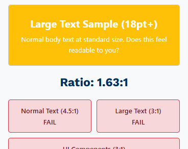
- Links that don’t meet the minimum 4.5:1 contrast ratio requirement
- Focus indicators with insufficient contrast against backgrounds
- Subtle hover states and button outlines that blend with backgrounds
- Modern minimal design with insufficient contrast
- Dark themes with inadequate light text contrast
- Gradient backgrounds affecting text readability
Essential Code Patterns
/* Ensure minimum 4.5:1 contrast for normal text */
.link-text {
    color: #0066cc; /* 4.51:1 on white background */
}

/* Large text: 18pt (24px) and larger, or 14pt (18.67px) and larger when bold */
.large-text {
    color: #767676; /* 4.54:1 on white background - meets AA large text */
    font-size: 24px; /* 18pt = 24px minimum for large text */
}

/* Fix subtle button outlines that blend with background */
.button {
    background: #0066cc;
    color: white;
    border: 2px solid #004499; /* Darker border for definition */
}

.button:hover {
    background: #0052a3; /* Darker on hover, still 4.5:1+ contrast */
    border: 2px solid #003366;
}

.button:focus {
    outline: 3px solid #d84a00; /* 4.3:1 on white, meets 3:1 for focus indicators */
    outline-offset: 2px;
}

/* Dark theme considerations */
.dark-theme {
    background: #1a1a1a;
    color: #ffffff; /* 15.3:1 contrast ratio */
}

/* Ensure text over gradients has sufficient contrast */
.gradient-banner {
    background: linear-gradient(135deg, #0066cc, #004499);
    color: white; /* Test against darkest gradient color */
    text-shadow: 1px 1px 2px rgba(0,0,0,0.8); /* Backup for edge cases */
}
Testing Tools
- WebAIM Contrast Checker
- Colour Contrast Analyser
- Browser DevTools accessibility features
Interactive Demos: Color Contrast guide: Interactive contrast checker and accessible color palettes
Quick Test: Use a contrast checker → Verify all text meets 4.5:1 (normal) or 3:1 (large text) → Check focus indicators
3 Form Accessibility – 487 Violations
WCAG Reference: 4.1.2 Name, Role, Value – Level A
Common Problems
- Calendar and notification buttons without proper labels
- Login and register elements missing labels
- iframe elements without accessible names
- Form validation errors shown without proper identification
- Submit buttons with only icons and no text alternatives
- Toggle buttons missing state information (pressed/unpressed)
Essential Code Patterns
<!-- Proper button labeling -->
<button aria-label="Open calendar">
    <svg aria-hidden="true"><!-- calendar icon --></svg>
</button>

<!-- Form labels -->
<label for="username">Username (required)</label>
<input type="text" id="username" name="username" required aria-describedby="username-help">
<div id="username-help">Enter your email address</div>

<!-- iframe accessibility -->
<iframe src="map.html" title="Interactive campus map"></iframe>

<!-- Form with proper error handling -->
<form novalidate>
    <input type="email"
           id="email"
           required
           aria-describedby="email-error"
           aria-invalid="false">
    <div id="email-error" role="alert"></div>
</form>
Interactive Demos: Form Labels guide: Screen reader announcement demo for labels, icon buttons and fieldsets
Quick Test: Use screen reader → Navigate through form → Verify all fields and buttons are clearly announced
4 Information and Relationships – 167 Violations
WCAG Reference: 1.3.1 Info and Relationships – Level A
Common Problems
- Skipped heading levels (for example an H1 followed directly by an H5). Not a WCAG failure on its own, but a best practice: a consistent hierarchy is what makes screen reader navigation work
- Improper semantic structure breaking screen reader navigation
- Content that looks like headings but isn’t marked up as headings
- Missing landmark regions (header, nav, main, aside, footer)
Essential Code Patterns
<!-- Proper heading hierarchy -->
<h1>Main Page Title</h1>
<h2>Section Title</h2>
<h3>Subsection Title</h3>
<h4>Sub-subsection Title</h4>
<!-- Semantic landmarks -->
<header>
<nav aria-label="Main navigation">
<ul>
<li><a href="/">Home</a></li>
<li><a href="/about">About</a></li>
</ul>
</nav>
</header>
<main>
<article>
<h1>Article Title</h1>
<section>
<h2>Section Title</h2>
</section>
</article>
</main>
<aside aria-label="Related articles">
<h2>Related Content</h2>
</aside>
<footer>
<p>© 2025 Company Name</p>
</footer>Quick Test: Use browser DevTools → Check document outline → Verify logical heading structure
5 Skip Links and Navigation – 179 Violations
WCAG Reference: 2.4.1 Bypass Blocks – Level A
Common Problems
- No skip links provided on pages
- Skip links that don’t work or lead to wrong content
- Skip links only visible on focus but poorly positioned
- Missing skip links for repetitive content blocks
Essential Code Patterns
<!-- Skip links should be first focusable elements -->
<a href="#main-content" class="skip-link">Skip to main content</a>
<a href="#navigation" class="skip-link">Skip to navigation</a>

<nav id="navigation" aria-label="Main navigation">
    <!-- Navigation items -->
</nav>

<main id="main-content" tabindex="-1">
    <h1>Main Content Starts Here</h1>
    <!-- Main page content -->
</main>

<!-- Skip links CSS -->
<style>
.skip-link {
    position: absolute;
    top: -40px;
    left: 6px;
    background: #000;
    color: #fff;
    padding: 8px 16px;
    text-decoration: none;
    border-radius: 0 0 4px 4px;
    z-index: 1000;
    transition: top 0.3s ease;
}

.skip-link:focus {
    top: 6px; /* Slide down when focused */
}
</style>
Interactive Demos: Keyboard Navigation guide: Skip links implementation and testing steps
Quick Test: Press Tab on page load → Skip link appears → Press Enter → Focus jumps to main content
6 Focus Visibility – 103 Violations
WCAG Reference: 2.4.7 Focus Visible – Level AA
Common Problems
- Interactive elements without visible focus indicators
- Focus indicators with insufficient contrast against backgrounds
- CSS that removes all focus indicators (outline: none)
- Focus indicators that disappear behind other elements
Essential Code Patterns
/* Custom focus indicators */
.button:focus {
    outline: 3px solid #d84a00; /* 4.3:1 on white */
    outline-offset: 2px;
}

/* For elements where outline doesn't work well */
.card:focus {
    box-shadow: 0 0 0 3px #d84a00;
}

/* For dark backgrounds */
.dark-theme .button:focus {
    outline: 3px solid #ffcc00; /* Bright yellow on dark */
    outline-offset: 2px;
}

/* NEVER remove focus indicators entirely */
/* DON'T do this: *:focus { outline: none; } */
Interactive Demos: Color Contrast guide: Focus indicator styling with sufficient contrast
Quick Test: Use Tab key → Navigate through all interactive elements → Verify clear focus indicators
7 Headings and Labels – 228 Violations
WCAG Reference: 2.4.6 Headings and Labels – Level AA
Common Problems
- Generic headings like “Welcome” that don’t describe content
- Form labels that don’t clearly explain what’s expected
- Links with generic text like “click here” or “read more”
- Buttons labeled only with icons
Essential Code Patterns
<!-- Descriptive headings -->
<h1>User Dashboard - Account Overview</h1>
<h2>Recent Transaction History</h2>
<h2>Account Security Settings</h2>

<!-- Descriptive form labels -->
<label for="search-products">Search products by name or category</label>
<input type="search" id="search-products" placeholder="e.g., wireless headphones">

<!-- Group related fields -->
<fieldset>
    <legend>Shipping Address</legend>
    <label for="street">Street Address (required)</label>
    <input type="text" id="street" name="street" required>

    <label for="city">City (required)</label>
    <input type="text" id="city" name="city" required>
</fieldset>
Interactive Demos: Form Labels guide: Descriptive label patterns and fieldset grouping
Quick Test: Read headings out of context → Do they make sense? → Check form labels are clear
8 Use of Color – 20 Violations
WCAG Reference: 1.4.1 Use of Color – Level A
Common Problems
- Links only indicated by color without other visual cues
- Form validation errors shown only in red color
- Status indicators using only color (green=success, red=error)
- Charts and graphs relying solely on color coding
Essential Code Patterns
<!-- Links with multiple indicators -->
<a href="/download" class="download-link">
    Download Report
    <svg aria-hidden="true"><!-- download icon --></svg>
</a>

<!-- Error messages with icons and text -->
<div class="error-message" role="alert">
    <svg aria-hidden="true"><!-- error icon --></svg>
    <strong>Error:</strong> Email address is required
</div>

<!-- Status indicators with text + icons + color -->
<span class="status-success">
    <svg aria-hidden="true"><!-- checkmark icon --></svg>
    Success
</span>
<span class="status-warning">
    <svg aria-hidden="true"><!-- warning icon --></svg>
    Warning
</span>
<span class="status-error">
    <svg aria-hidden="true"><!-- X icon --></svg>
    Error
</span>
Interactive Demos: Form Validation guide: Errors identified by text and icons, not just color
Quick Test: Use grayscale filter → Check all information is still clear → Test with color blindness simulator
9 Link Purpose – 59 Violations
WCAG Reference: 2.4.4 Link Purpose (In Context) – Level A
Common Problems
- Multiple “read more” or “click here” links on the same page
- Links that don’t describe their destination
- Download links without file type or size information
- Links that open in new windows without warning
Essential Code Patterns
<!-- Descriptive link text -->
<!-- BAD: <a href="/report.pdf">Click here</a> -->

<!-- GOOD -->
<a href="/report.pdf">Download accessibility report (PDF, 2.3MB)</a>
<a href="/wcag-guide">Read more about WCAG implementation</a>

<!-- External links with indicators -->
<a href="https://w3.org/WAI" rel="noopener">
    Web Accessibility Initiative
    <span class="sr-only">(opens in new window)</span>
    <svg aria-hidden="true" class="external-icon">
        <!-- external link icon -->
    </svg>
</a>

<!-- Context-specific "read more" links -->
<article>
    <h3>Product Review</h3>
    <p>Our latest smartphone review...</p>
    <a href="/review/smartphone-2025">Read full smartphone review</a>
</article>
Quick Test: Read link text alone → Does it make sense out of context? → Check external link warnings
10 Reflow and Responsive Design – 149 Violations
WCAG Reference: 1.4.10 Reflow – Level AA
Common Problems
- Fixed-width layouts that break when zoomed
- Text that overlaps or disappears at high zoom levels
- Horizontal scrolling required at 400% zoom
- Content that becomes unusable on small screens
Essential Code Patterns
/* Responsive design without horizontal scrolling */
.container {
    max-width: 1200px;
    width: 100%;
    margin: 0 auto;
    padding: 0 20px;
}

/* Flexible layouts */
.grid {
    display: grid;
    grid-template-columns: repeat(auto-fit, minmax(300px, 1fr));
    gap: 20px;
}

/* Text that scales properly */
body {
    font-size: 1rem; /* Use rem units */
    line-height: 1.5;
}

/* Responsive images */
img {
    max-width: 100%;
    height: auto;
}

/* Avoid fixed widths */
/* BAD: .sidebar { width: 300px; } */

/* Use flexible widths */
.sidebar {
        width: 100%;
    max-width: 300px;
}
Quick Test: Zoom to 400% → Verify no horizontal scrolling → Check all content remains accessible
11 Focus Order and Navigation – 122 Violations
WCAG Reference: 2.4.3 Focus Order – Level A
Common Problems
- Sidebars that interrupt main content flow
- Modal dialogs that don’t trap focus properly
- Dynamic content insertion breaking tab order
- Skip links that don’t work correctly
- Illogical tab sequences that confuse keyboard users
Essential Code Patterns
<!-- Use tabindex to control focus order when needed -->
<main id="main-content">
    <h1 tabindex="-1">Page Title</h1> <!-- Can receive focus programmatically -->

    <nav aria-label="Page contents">
        <a href="#section1">Section 1</a>
        <a href="#section2">Section 2</a>
    </nav>

    <section id="section1" tabindex="-1">
        <h2>Section 1</h2>
        <!-- Content -->
    </section>
</main>

<!-- Modal focus trap JavaScript -->
<script>
function openModal(modalId) {
    const modal = document.getElementById(modalId);
    const focusableElements = modal.querySelectorAll(
        'button, [href], input, select, textarea, [tabindex]:not([tabindex="-1"])'
    );

    const firstElement = focusableElements[0];
    const lastElement = focusableElements[focusableElements.length - 1];

    // Focus first element
    firstElement.focus();

    // Trap focus within modal
    modal.addEventListener('keydown', function(e) {
        if (e.key === 'Tab') {
            if (e.shiftKey) {
                if (document.activeElement === firstElement) {
                    lastElement.focus();
                    e.preventDefault();
                }
            } else {
                if (document.activeElement === lastElement) {
                    firstElement.focus();
                    e.preventDefault();
                }
            }
        }
    });
}
</script>
Interactive Demos: Keyboard Navigation guide: Tab order management and focus trapping for modals
Quick Test: Open modal → Press Tab → Verify focus stays within modal → Press Escape → Focus returns to trigger
12 Image Alt Text – 301 Violations
WCAG Reference: 1.1.1 Non-text Content – Level A
Common Problems
- Images don’t have alternative text or are not descriptive
- Icons lack alternative text descriptions
- Decorative images with unnecessary alt text
- Complex images without proper descriptions
- Generic alt text like “image” or “photo”
Essential Code Patterns
<!-- Informative images -->
<img src="chart.png" alt="Sales increased 25% from January to March 2025">

<!-- Decorative images -->
<img src="decoration.png" alt="" role="presentation">

<!-- Complex images with detailed description -->
<img src="process-diagram.png" alt="User registration process" aria-describedby="process-desc">
<div id="process-desc">
    The diagram shows 4 steps: 1) User fills form, 2) Email verification,
    3) Admin approval, 4) Account activated
</div>

<!-- Icons in buttons -->
<button>
    <svg aria-hidden="true"><!-- save icon --></svg>
    Save Document
</button>

<!-- Icon-only buttons -->
<button aria-label="Close dialog">
    <svg aria-hidden="true"><!-- close icon --></svg>
</button>
Quick Test: Turn off images → Use screen reader → Verify all important visual information is conveyed through alt text
13 ARIA Implementation Issues – 154 Violations
WCAG Reference: 4.1.2 Name, Role, Value – Level A
Common Problems
- Incorrect ARIA landmark usage
- Missing or wrong ARIA controls relationships
- Custom components without proper ARIA states
- Conflicting semantic markup and ARIA
- Improper live region implementation
Essential Code Patterns
<!-- Correct ARIA landmark structure -->
<header role="banner">
    <nav role="navigation" aria-label="Main navigation">
        <ul>
            <li><a href="#" aria-current="page">Home</a></li>
            <li><a href="#">About</a></li>
        </ul>
    </nav>
</header>

<main role="main">
    <section aria-labelledby="products-heading">
        <h2 id="products-heading">Our Products</h2>

        <!-- Expandable content with proper ARIA -->
        <button aria-expanded="false"
                aria-controls="product-details"
                onclick="toggleDetails()">
            Show Product Details
        </button>

        <div id="product-details" aria-hidden="true">
            <p>Detailed product information...</p>
        </div>
    </section>
</main>

<!-- Live regions for dynamic content -->
<div id="status-polite" aria-live="polite" aria-atomic="true" class="sr-only"></div>
<div id="status-assertive" aria-live="assertive" aria-atomic="true" class="sr-only"></div>
Testing ARIA
- Use screen readers (NVDA, JAWS, VoiceOver) to test ARIA announcements
- Browser DevTools accessibility tree to verify ARIA structure
- W3C Using ARIA Guide
- ARIA Authoring Practices Guide
Interactive Demos: Accessible Dropdown Menus guide: Working ARIA menu pattern with state management
Quick Test: Use screen reader → Navigate landmarks → Test dynamic content → Verify state changes are announced
14 Form Validation and Error Identification – 45 Violations
WCAG Reference: 3.3.1 Error Identification – Level A | 3.3.2 Labels or Instructions – Level A
Common Problems
- Form validation errors shown without proper identification
- Submit buttons with only icons and no text alternatives
- Toggle buttons missing state information (pressed/unpressed)
- Required fields not clearly marked
- Error messages not announced to screen readers
Essential Code Patterns
<!-- Form with proper error handling -->
<form novalidate>
    <label for="email">
        Email Address
        <span class="required" aria-label="required">*</span>
    </label>
    <input type="email"
           id="email"
           required
           aria-describedby="email-error email-help"
           aria-invalid="false">
    <div id="email-help">We'll never share your email</div>
    <div id="email-error" role="alert" aria-live="polite"></div>

    <button type="submit" aria-describedby="submit-help">
        <svg aria-hidden="true"><!-- submit icon --></svg>
        Create Account
    </button>
    <div id="submit-help">By clicking, you agree to our terms</div>
</form>

<!-- JavaScript for error handling -->
<script>
function validateEmail(input) {
    const errorDiv = document.getElementById('email-error');

    if (!input.validity.valid) {
        input.setAttribute('aria-invalid', 'true');
        errorDiv.textContent = 'Please enter a valid email address';
    } else {
        input.setAttribute('aria-invalid', 'false');
        errorDiv.textContent = '';
    }
}
</script>
Interactive Demos: Form Validation guide: Accessible registration form with real-time validation
Quick Test: Submit form with errors → Check error messages are announced → Verify error association with fields
15 Page Language and Accessibility Name – 123 Violations
WCAG Reference: 3.1.1 Language of Page – Level A | 2.5.3 Label in Name – Level A
Common Problems
- Missing lang attribute on html element
- Accessible names that don’t match visible text
- Language changes not announced to screen readers
- Voice control users can’t activate elements by saying visible text
Essential Code Patterns
<!-- Set page language -->
<html lang="en">

<!-- Language changes -->
<p>Welcome! <span lang="es">¡Bienvenidos!</span> <span lang="fr">Bienvenue!</span></p>

<!-- Accessible names that match visible text -->
<!-- BAD: Accessible name doesn't include visible text -->
<button aria-label="Submit form">Send Message</button>

<!-- GOOD: Accessible name starts with visible text -->
<button aria-label="Send Message - Submit contact form">Send Message</button>

<!-- Even better: Let visible text be the accessible name -->
<button>Send Message</button>
Interactive Demos: Form Labels guide: Accessible names that match visible text (2.5.3 Label in Name)
Quick Test: Check HTML lang attribute → Test voice control with button text → Verify language changes
Testing Checklist
Automated Testing
- Run axe-core in CI/CD pipeline
- Use WAVE browser extension
- Check color contrast with WebAIM tool
- Lighthouse Accessibility: Built into Chrome DevTools
Manual Testing
- Navigate entire site using only keyboard
- Test with screen reader (NVDA, JAWS, VoiceOver)
- Verify 400% zoom doesn’t break layout
- Check that all functionality works without color
- Validate HTML structure and semantics
- Keyboard Testing: Unplug your mouse and navigate with Tab, Arrow keys, Enter, Space
Code Review Points
- All images have appropriate alt text
- Forms have proper labels and validation
- Heading structure is logical (no skipped levels)
- Focus indicators are visible and have sufficient contrast
- Interactive elements are keyboard accessible
- Color is not the only way to convey information
Quick Reference Links
- WCAG 2.2 Guidelines: the full W3C recommendation
- How to Meet WCAG 2.2 (Quick Reference): filterable list of all success criteria and techniques
- ARIA Authoring Practices Guide: design patterns for accessible components
- WebAIM resources: articles, checklists and testing tools
- MDN Web Accessibility documentation: developer reference for HTML, ARIA and CSS
- The A11y Project: community-driven accessibility checklist and posts
- Accessible Colors: tool that suggests compliant color alternatives
- Axe DevTools browser extension: automated accessibility testing