
- by Quint Verkoeijen
- 0 Comments
- Guide
- 19 January 2024
Whether you’re using Powerpoint, Keynote, Slides or Impress, this guide will teach you the basics of creating accessible presentations. You can also apply these tips to start making your (PDF) documents more accessible.
10 tips for making content accessible
Tip 1: Use contrasting colors for text and background
An easy way to check if your colors of choice are accessible, is to use the WebAIM Color Contrast Checker. If you prefer to use a color picker in your presentation app, you could use Colour Contrast Analyser (CCA).
The WCAG guideline for contrast states that text contrast need a ratio of at least 4.5:1. For visual elements such as icons, the ratio is 3:1.
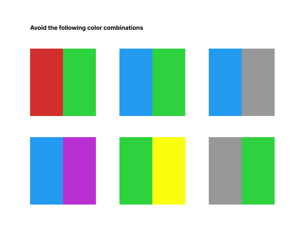
Tip 2: Choose the right color combinations
Avoid color combinations that are difficult to distinguish for people with color blindness. Common problematic combinations are red and green, blue and green, blue and grey, blue and purple, green and yellow, green and gray. Note that even for people without color vision deficiencies, these combinations can cause reading difficulties.
Tip 3: Don't use color alone to convey information
Never use color on its own to convey information to your audience. People with visual impairments could miss out on key information if you don’t avoid this mistake. To fix this, you can implement multiple cues for conveying your information. This can be as simple as adding text to support the color, or adding both an icon and text for example.
To test this, you can navigate to the ‘view’ tab in PowerPoint and select ‘Grayscale’. Your presentation will now be viewed without the use of colors. Is all the information you wish to convey still clear? To revert this effect, simply click the ‘back to color view’ button.
Tip 4: Use solid backgrounds
Background images with visual patterns or images can also cause readability problems. Off-white (pastel or cream) backgrounds make it easier for people with dyslexia to read your content. Darker backgrounds are great for adding more contrast and are easier on the eyes.
Tip 5: Choose the right font
Chances are you must follow your company’s guidelines for font usage. However, if accessibility is the goal, consider using sans-serif fonts with enough spacing between letters such as Segoe UI or Verdana. Fonts like these are best for legibility, meaning it’s easier to distinguish one letter from another.
Use a font size of at least 18pt and don’t worry about choosing an even larger size. Additionaly, ensure the use of sufficient whitespace between each line of text.
Tip 6: Use descriptive links
Links should always refer to the goal of the link. Here are two comparisons between accessible and non-accessible links:
- DO NOT: To read the full list of assignments, click here.
- DO: Read the full list of assignments.
- DO NOT: Read more.
- DO: Read more about accessibility.
Tip 7: Title your slides
People with visual impairments rely on titles to navigate through your presentation, so make sure to always give each slide a clear title.
Tip 8: Reading order
Those same people often use screen readers to interpret information for them. In order for them to experience the presentation the way you intend, you must set the correct reading order for all elements on the slide. Here’s how to do just that:
In PowerPoint, look for the ‘review’ tab. Next, click the ‘Check Accessibility’ dropdown on the left side of the toolbar. Choose the ‘Reading Order Pane’ option. You should now be able to see the reading order of your slides on the right side of your screen. By selecting an element and using the up and down arrows in the top right, you can manually create the correct order.
Tip 9: Add descriptive text to images
All informative images must have a text alternative so people with visual impairments get these images described when using a screen reader. Follow these simple steps to add alt-text to images in PowerPoint:
- Right-click an image
- Select ‘View Alt Text…’
- In the panel that pops up, add your alt text.
Your alt text should describe the contents of the image. You can even let PowerPoint use AI to generate these alt texts for you, but make sure to review them so the images are described accurately. In the next part of this guide, we will dive a little deeper into alt text and how to apply this principle to complex graphics and graphs.
Tip 10: Add captions to videos
If you’re adding video material to your presentation, make sure the video has captions for people who are hard of hearing or are in a situation where they can’t turn on the sound. Captions are like subtitles, but also include a written description of the audio, such as [a door slams].
Add video descriptions to also make the video accessible to blind users.
Accessible graphics and charts
There are lots of different kinds of visuals you may want to add to your presentation. You now understand the basics of creating accessible presentations, but what about more complex images such as graphs, charts or equations?
General tips regarding graphics
- Add alt text that describes all the important information. This might be all visible information, or only certain elements of the graph that are important to the message you want to convey.
- If you’re making a graph yourself, make sure that the color contrasts are accepted by the WCAG standards. If it is an image from the internet, you want to look for an image that has a better contrast or change the background of your PowerPoint to a different color.
- If applicable add a legend and labels so that it is clear and easy to understand.
- For some graphs, take a bar graph for example, it is possible to translate the information to a table. A table is text-based so it could be easier for visually impaired people to understand. We will show you an example of this in the following figure:
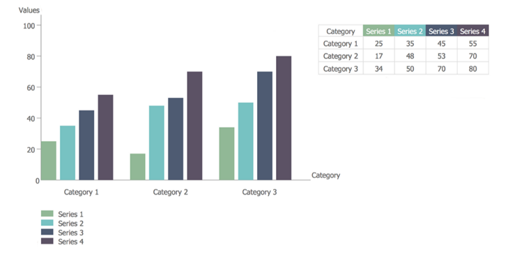
If you want to add an alt text to the graph, rather than adding a table, you need to describe the axes. For this example the alt text could look like this:
Graphs with as y as the value and on the x as the category:
- Series 1 has 25 as value in category 1, 17 in category 2 and 34 in category 3.
- Series 2 has 35 in category 1, 48 in category 2 and 50 in category 3.
- Series 3 has 45 in category 1, 53 in category 2 and 70 in category 3.
- Series 4 has 55 in category 1, 70 in category 2 and 80 in category 3
In addition, if for example only category 1 is important, the alt description will get way shorter:
Category 1 has the following values:
- Serie 1 = 25
- Serie 2 = 35
- Serie 3 = 45
- Serie 4 = 55
Whenever you’re conveying information using graphs, think carefully about how you could convey the same information to people who are unable to see the graph.

Reviewing the accessibility of your presentation
If you’ve implemented the tips above, you’re well on your way making your presentation accessible! We will now show you how to review and improve the accessibility of your presentation, so you’re including as many people as possible.
Use the built-in accessibility checker in PowerPoint
Navigate to the Review tab and click the ‘check accessibility’ symbol. Automatic checkers such as this one are a great tool to find basic accessibility problems. However, they won’t identify all the possible issues in your presentation. For example, this accessibility checker won’t indicate if the reading order is inaccurate or if color is the sole method of conveying information. This is why it’s important to learn how to check for accessibility issues yourself, or ask an expert to do so.
Use a screen reader
Consider downloading a free screen reader such as NVDA to review your own presentation. Navigate through your slides, test the reading order, alt texts, hyperlinks, slide titles and use of color. Ensure any videos are accessible by listening to descriptions and captions. Make necessary adjustments based on your insights.
Use the WCAG guidelines
The Web Content Accessibility Guidelines (WCAG) are a set of guidelines developed by the World Wide Web Consortium (W3C) to ensure the accessibility of web content for people with disabilities. While originally designed for web content, the principles and guidelines can be applied to various digital formats, including presentations. To be frank, these guidelines are quite extensive and it takes time to understand and apply them. If you want to dive deeper into accessibility, the WCAG guidelines are the perfect place to start.
Ask an expert
If you apply all the basic tips we just shared, you should be well on your way to creating accessible presentations. However, if you want to make sure your presentation is accessible to as many people as possible, consider asking an expert for help. This way you’re guaranteed to end up with an inclusive, accessible presentation.
Want to know how to organize a presentation for people with a possible disability? Read Delivering a presentation accessible