- by Marit van Nuland
- 0 Comments
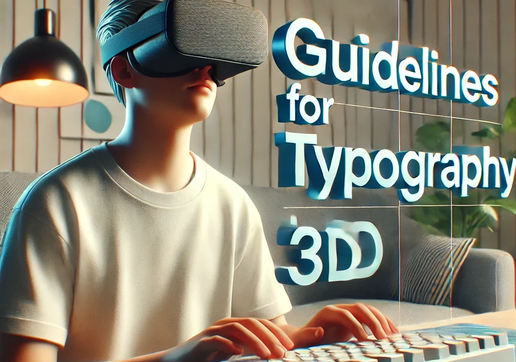
- Article
- 17 June 2024
Creating accessible text in 3D environments is crucial for people with a visual impairment. This guide provides guidelines with examples and best practices to make text in XR and 3D spaces readable and user-friendly.
Extended Reality (XR) is an umbrella term encompassing various forms of computer-altered reality, including Virtual Reality (VR), Augmented Reality (AR), and Mixed Reality (MR).
The guidelines we set up are based on A-frame. The examples and values we share, might not directly be applicable to other frameworks.
1. General Guidelines
Readability
- Use high-contrast colours, such as white text on a dark background. This guideline will hold the same standards are the existing WCAG guidelines for contrast. Regular text needs a minimum contrast ratio of 4.5:1 to their background, while large text needs to have at least a ratio of 3:1.
- Use a sans-serif or a font designed for good readability, like Atkinson Hyperlegible_Regular or Roboto.
- Make sure the text is not too bold so that the lines appear too close to each other. Also avoid lines that are too thin like Dejavu even though this is a Sans-Serif font. We created an example using an A-Frame scene using the fonts Roboto, Dejavu and Atkinson Hyperlegible_Regular. For the last font, you will find a link at the bottom of this article.
Try the fonts in this VR experience
- Ensure that the position does NOT go further away than -15 if the camera is on 0 1.6 0. In the following model you can find text sizes for three distances. Based on this, we made the matrix below with the recommended font size for each distance.
Text sizes
| Camera stand | Position of the text | Recommended for |
| <a-entity camera position=”0 1.6 0″ look-controls></a-entity> | <a-entity position=”5 2 -15“> <a-entity text=”value: Position -15; font: roboto; width: 6; color: #333; wrapCount: 10;”></a-entity> </a-entity> | The minimum recommended size. If it is smaller, the user may not be able to read the text. |
| <a-entity camera position=”0 1.6 0″ look-controls></a-entity> | <a-entity position=”0 0 -9″> <a-entity text=”value: position -9; font: roboto; width: 6; color: #333; wrapCount: 10;”></a-entity> </a-entity> | Normal text that is not too long. If the text is still unreadable, there should be a function implemented that makes it possible to zoom in the text and to always have the text straight in front of the user. |
| <a-entity camera position=”0 1.6 0″ look-controls></a-entity> | <a-entity position=”0 -1 -6″> <a-entity text=”value: Position -6; font: roboto; width: 6; color: #333; wrapCount: 10;”></a-entity> </a-entity> | Headings |
Placement
- Place the text in such a way that it doesn’t get interrupted by another object, for example, a tree. It is not possible to never have something in your view if there are multiple objects, but you need to make sure there is enough space in between the objects so that you can navigate in between the objects.
View the example for the text positions. WARNING: This example does not allow for camera rotation, only for movement using the left joystick.
- There is also an option to make the object move into the direction of your POV. Here you will find a small example using A-Frame.
View the example of billboarding. WARNING: This example still has some vulnerabilities. It is only used to demonstrate how billboarding could be used to help with reading the text.
Hierarchy
- Make sure that there is a clear hierarchy in the text. This can be done by using a bigger size or amplifying important text. Example: Use bold text for headings and subtle styles for paragraph, while highlighting the important parts of the text in red.
Consistency
- Make sure to keep using the same font across the whole environment. This includes font, sizing, text height but also color and how many characters you place in the POV. This means if you make your text in the color dark blue, it will stay that way for the whole model. And if you make a sentence of 12 words before you cut it off, then keep it that way as well.
2. Technical Considerations
Resolution
- 3D models need to be rendered. Here we will not give a clear indication on what the best value is, but we recommend keeping this in mind. Example: Render text at a minimum of 72 DPI to avoid pixelation.
Scalability
- Magnification of the text: we recommend adding in a function where for example if the user clicks on a text it will zoom in the tex,t so it will be read easier. This could also mean the text gets placed right in front of the user.
- Making interactive text: If the user can click on text, there could also be a function that allows the user to reveal more information. Since the screen has a limited size, and you don’t want the screen to be full of text the whole time, it is possible to hide the text and make it visible with a user interaction.
Reading distance
- Don’t make the distance closer than 1.2 meter. Based on research, it is recommended to position your text 2–3 meters away from the camera. Also make sure the distance is not closer than 1.2 meter as this can lead to eye strain. We recommend starting at a distance of 2.5 meter and then adjusting the font size and distance though tests.

3. Interaction and Dynamics
Interactivity
Make it clear that an object/text is interactive. This point is an addition to the previous point about scalability. Adding interactive elements is a key part of a navigable 3D environment. This could be buttons that allow the user to teleport throughout the model without a need to control the controllers, but it could also mean providing an explanation on certain parts of the model. Like game rules or how to ask for help. Certain accessible modes and so on.
To make the user know that an element is interactive, you could change the color of the text before and on hover, but it’s also possible to make an entire object interactive. You can make this clear by providing it with a different color from the rest of the objects, or by providing an explanation. There is also the option to make it into a button.
Dynamic Text
When adding animations or real-time data that keeps updating, make sure that this doesn’t contain too much flickering.
The WCAG guideline 2.3.2 says that there is a limit to the amount an animation is allowed to flash. Make sure to follow this rule as to keep the text or the animated element readable. This point is mostly useful for other parties that are not visually impaired, but those advantages will be left up to your own resource.
Example: Implement transition effects such as fading to help users process the change.
4. Aesthetics and Design
Alignment
Align the objects all over the 360 view in such a way that the elements are spread over the 3D model but the user does know that there are more elements on the other sides of the model.
The alignment of text is just as important in VR as it is on a website. Since the environment is quite different, you need to keep in mind that the user can move their head. Make sure that it is clear for the user where the text is. So for example you have three platforms with text on there, then you can place the first one in the middle with the other two on the side like barely in view. Make sure that it doesn’t disappear out of the view, since then the user doesn’t know that there are also objects.
6. Performance
Testing
- Test the models on different devices.
- Since the guidelines are meant for the whole XR spectrum, the output might look different in other contexts. We recommend letting the target audience test your application so you can make adjustments based on their feedback.
7. Accessibility
Screen Reader Compatibility
- Purpose: Make 3D environments accessible to users who rely on screen readers.
- Implementation:
- Provide meaningful descriptions for all interactive elements using ARIA tags.
- Ensure that dynamic content updates are announced to the user.
- Test with different screen readers to identify and address any compatibility issues.
ARIA Tags
- Purpose: Enhance accessibility by providing additional context and functionality to screen readers.
- Implementation:
- Use ARIA roles to define the purpose of elements (e.g.,
role="button"). - Use ARIA states and properties to convey the current state of elements (e.g.,
aria-expanded="false"). - Ensure that ARIA labels (
aria-label) provide clear and concise descriptions of elements.
- Use ARIA roles to define the purpose of elements (e.g.,
Keyboard Accessibility
- Purpose: Ensure that users can navigate and interact with 3D environments using a keyboard.
- Implementation:
- Enable focus on interactive elements using the
tabindexattribute. - Use logical tab order to provide a smooth navigation experience.
- Implement keyboard event listeners for common actions (e.g., arrow keys for navigation, Enter for activation).
- Enable focus on interactive elements using the
8. Examples
Guidance Text
- Example: Place clear, concise instruction texts next to interactive elements such as buttons and menus.
- Use visual markers like arrows or borders to emphasize guidance text.
Feedback Text
- Example: Provide immediate feedback via text for user actions, such as “Your change has been saved”.
- Use color coding such as green for success and red for errors to make feedback clear. However, make sure color is not the only way in which you convey important information.
Conclusion
By following these guidelines, software developers can create accessible and effective text in 3D environments. Careful consideration of readability, placement, interaction, and performance will ensure that text elements complement the 3D space and provide valuable information to users.
Links
Braille Institute Staff. (2024, 9 februari). Download the Atkinson hyperlegible font | Braille Institute.
Contrast Guidelines | WAI | W3C. (z.d.). W3C.
https://www.w3.org/WAI/WCAG21/Understanding/contrast-minimum.html