1. Design methodically
Any color scheme or theme you develop can impact accessibility.
Make sure you attain the same accessibility quality level regardless of the theme chosen, or just stick to a single theme.
Listen to your users.
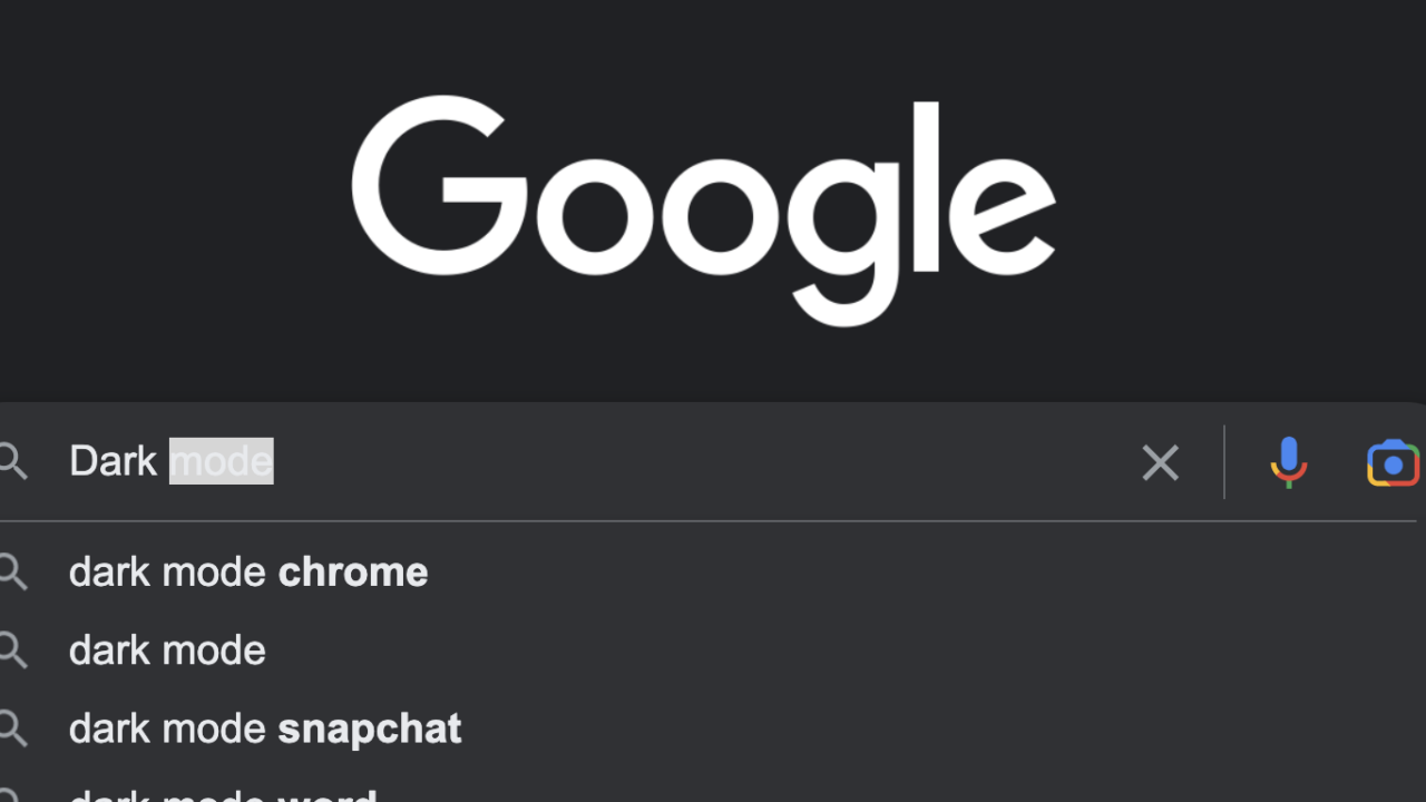
There are more designs that deliver a dark mode experience, which one is the most accessible and usable?
Also be sure to test with users, including those who didn’t require a dark mode in the first place.
Review design guidelines and best practices for your platform concerning app theming and dark mode.
For instance, Apple’s Human Interface Guidelines has something to say about dark mode.
2. Check for contrast
This one is encompassed by the former point, but deserves to be called out specifically.
When you choose a color scheme, you have to choose an alternative for (or stick with) each color used in the light color scheme.
The same rules about color blindness, contrast, et cetera apply.
This requires deliberation and not just copying or picking colors off the cuff.
Use automated color contrast testing tools to verify your design.
Google Search has not taken this message.
According to Google, Google Search adopts the color scheme of the device/browser.
However, this gives unpredictable results. For one, under macOS Ventura with Brave v1.45.118, the styling becomes inaccessible:


This is hard to read due to poor contrast, even to a person without visual disabilities.
3. Surprise nor force
First, follow the preferences the user has set.
The prefers-color-scheme media feature allows you to conditionally apply a dark or light color scheme.
Then, also allow the user to override this global preference.
For example, when I use Google Maps on my mobile phone, I deliberately disable dark color scheme even though I have it applied across my mobile operating system.
One could say this is because their dark mode implementation is poor, but I find it hard to orient the pitch black map background.
Be sure to make it easy to switch themes, in particular when dark mode is added to a previously single-themed app and when it is applied automatically (e.g., based on prefers-color-scheme).
Also consider that the user of your user interface may not be same, even if the device or session is the same.
For example, different users in a household can check the news using e.g., a browser on a smart TV.
In some cases, the dark color scheme substitutes the light color scheme.
That’s a prime example of forcing users.
The Discord designers did this once, leading to massive complaints.
4. Mind your content
Some illustrations blend in into the environment, namely vector graphics.
On the web, this comes down to SVG images. Whenever SVG graphics are used anywhere in your app or website, they may lose implicit dependency on a white background color.See for example this issue I found in Microsoft Azure’s docs.

Use relative references to colors rather than absolute, where possible.
For example, CSS has the currentcolor keyword, and lets you inherit the foreground color after setting it once per document or SVG image, rather than assuming the foreground color is black, or at least more black than white.
In some cases, user generated content may have been styled by the users themselves, and testing or patching all that content will be challenging. For example, some forum web apps allow users to color text themselves.
And for open source products, contributors may add illustrations to e.g., docs.
I have yet to encounter an open source product team to methodically assess the accessibility impact of newly contributed images.
5. Consider a native solution
Operating systems offer various accessibility features, such as Windows High Contrast Mode or macOS Invert Colors. If your main reason to offer a dark mode is to enhance accessibility, then first consider whether a native solution does the job. After all, given these five points, developing a dark mode requires a substantial accessibility investment.
I hope this post has given you some useful tips on adding an accessible dark mode feature to your app. What other issues have you encountered when developing a dark mode theme?